[et_pb_section fb_built=”1″ admin_label=”section” _builder_version=”3.0.47″ custom_padding=”0|0px|41.7031px|0px|false|false”][et_pb_row admin_label=”row” _builder_version=”3.0.48″ background_size=”initial” background_position=”top_left” background_repeat=”repeat”][et_pb_column type=”4_4″ _builder_version=”3.0.47″ parallax=”off” parallax_method=”on”][et_pb_text admin_label=”Text” _builder_version=”3.0.74″ background_size=”initial” background_position=”top_left” background_repeat=”repeat”]
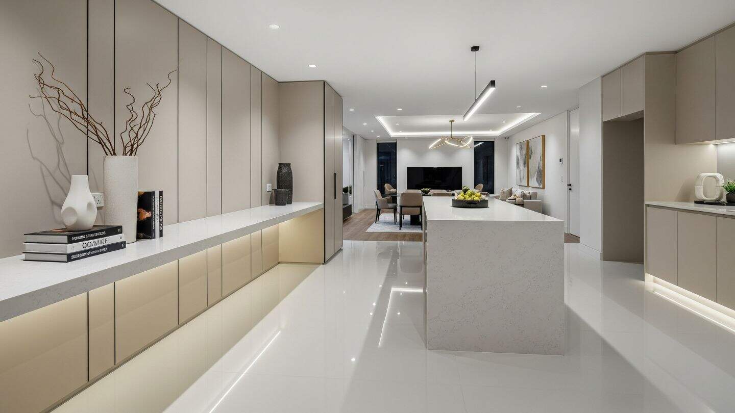
The Importance of Contrast in Interior Design
Courtesy of www.freshome.com
Interior design buffs know how important a room’s first impression can be. There are some spaces that, upon first glance, make your breath catch because its elements are so visually striking, yet still fit together. Other rooms seem to fall flat, almost like something is missing.
Contrast is the secret ingredient that gives those memorable spaces their impact. When used correctly, this foundational design principle can add a huge dose of visual interest to your interiors while simultaneously pulling it together. Many consider it an essential component to any successful interior.
However, if you’re new to this idea, don’t worry, this post is for you. Read on to learn more about the importance of contrast, and to learn how to apply it to your next project. This is the back-to-basics primer you need to take your designs to the next level.
Create contrast using colour
This is probably the most obvious use of contrast and the easiest! Giving a room a complementary colour scheme — or one that utilizes two shades on opposite ends of the colour wheel — will create the strongest impact. For this, black and white will never go out of style. However, if your sense of style is a bit more colourful, you could also use colour combos like blue and orange or purple and yellow.
As with any design, keep in mind that in these spaces, one colour needs to take a dominant role while the other accents it. Consider choosing one shade for the walls while the other is used in textiles, furniture and accessories.
For those who aren’t quite ready for their spaces to be that high contrast, there is a way to tone things down. You just need to add in additional neutrals. Doing so will give eyes a spot to rest while also providing a quiet background for your contrasting colours to pop out against.
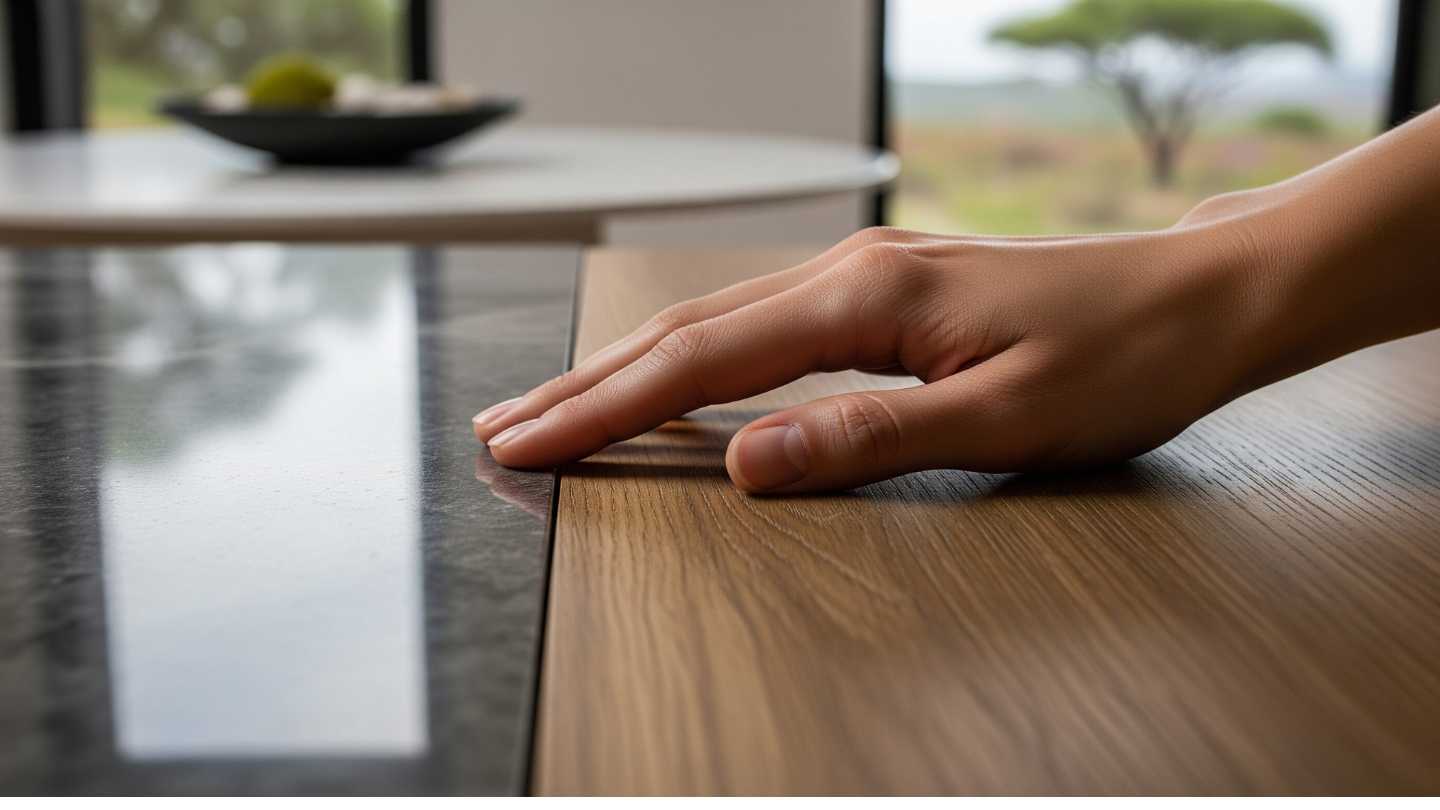
Play around with texture
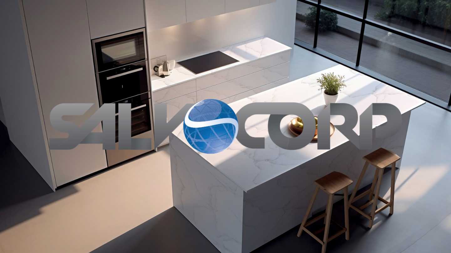
We can’t stress the importance of texture enough, but in this case, the two concepts go hand in hand. In interior design parlance, texture refers to the way we perceive that design elements feel. For example, imagine how different it would feel to run your hand over the cool and bumpy tile backsplash versus the smooth table top in the picture above.
Putting two contrasting textures together adds visual weight to the space, meaning that components of your design will be able to draw the eye more easily. This works best when two contrasting textures — rough and smooth — are used in close proximity to each other.
Mix and match materials to show the importance of contrast
This step is almost achieved by default. Every design is inherently going to include a few different materials because of all the design elements put together to create the final look. However, in this case, we mean purposefully choosing items that feel distinct from each other.
This can either refer to what material the product is made of or how the product looks. For furniture, think about mixing natural materials like wood and stone against metals like chrome and steel. Likewise, when you’re concentrating on fabrics, think about choosing some patterned items while others are simply a solid colour.
Try out a variety of shapes
Shape and form are also great ways to add contrast to a space. It’s not hard to see why when you consider how different sharp, angled corners can seem from smooth, rounded edges. This type of contrast is most often seen with furniture, but it can also be used with accessories like mirrors or even through various types of wall art.
Obviously, some design styles work better here than others. You may want to consider this tip if you favour aesthetics that rely heavily on geometric shapes like mid-century modern or Scandinavian. An eclectic design, which favours mixing-and-matching different styles, would also be a good fit.
Whichever look you decide on, this is one area where balance makes all the difference. Make sure you have a relatively simple background, meaning one with muted colours and simple materials so you make it easy for shape to take centre stage.
Contrast is one of interior design’s fundamental principles. It’s a designer’s secret weapon for ensuring a room draws the eye while still seeming cohesive. The key is knowing where — and how — to use it correctly. Salvocorp’s range of products and colours can help you create the perfect combination of contrasts with textures, styles and colours. Our technical consultants can also help you choose the contrast element that suits your interior perfectly.
[/et_pb_text][/et_pb_column][/et_pb_row][/et_pb_section]